Roles
Product design
User research
UX design
UI design
Prototyping
Usability testing
Design systems
Accessibility
Product strategy
Developer handoff
Overview
Members were experiencing unreliable access to gym facilities, while staff were regularly pulled away from the gym floor to troubleshoot technology issues and support day-to-day member tasks.
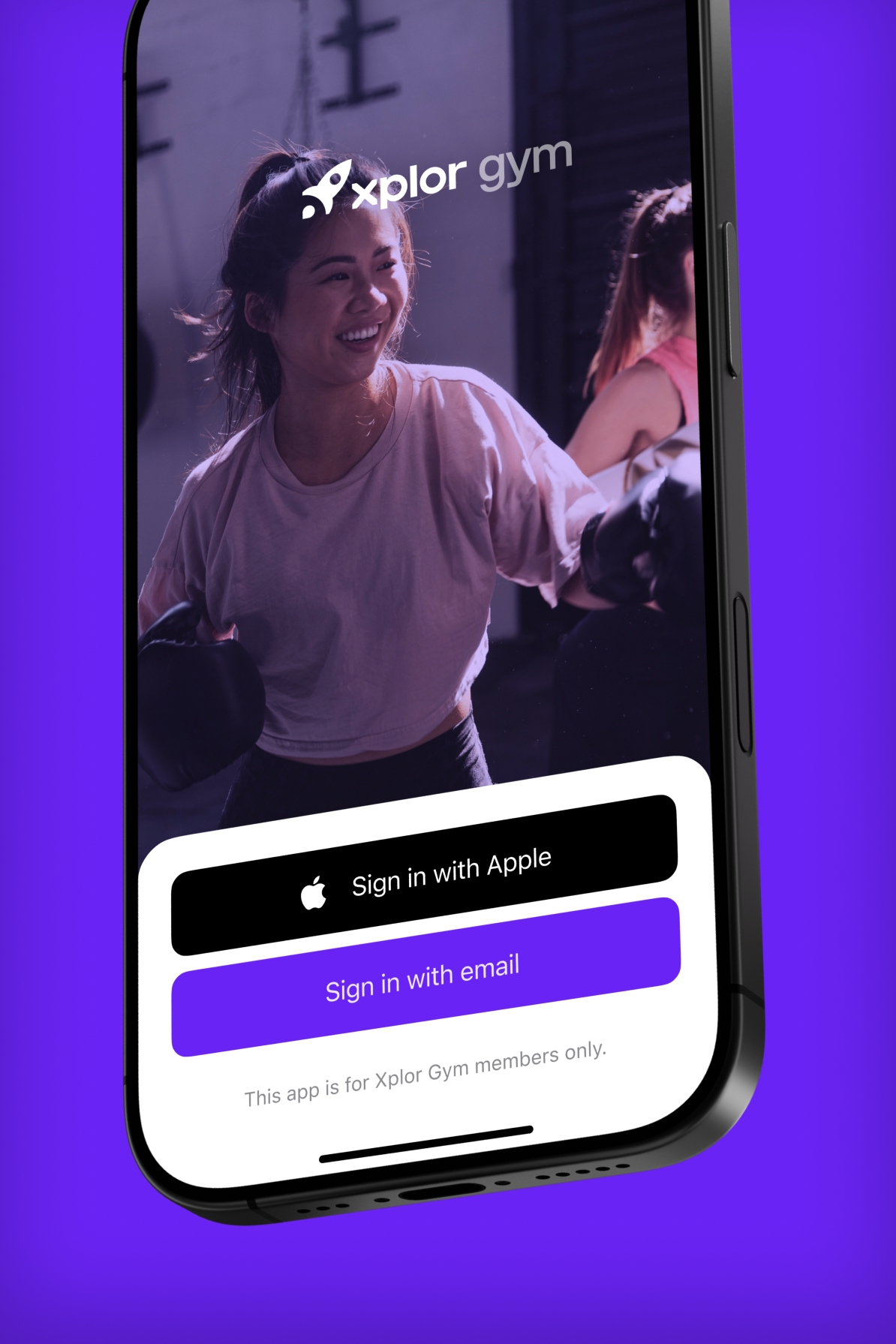
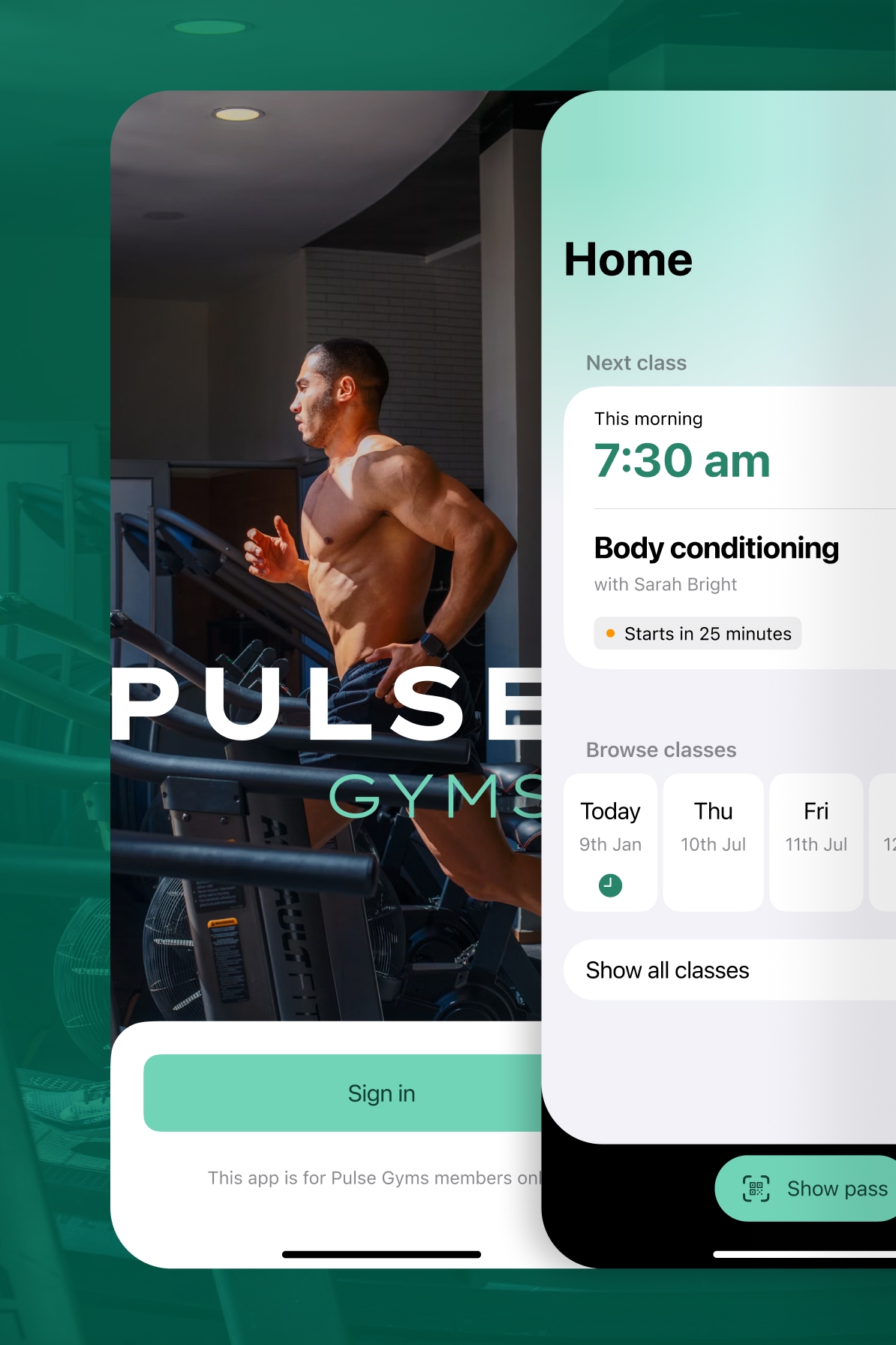
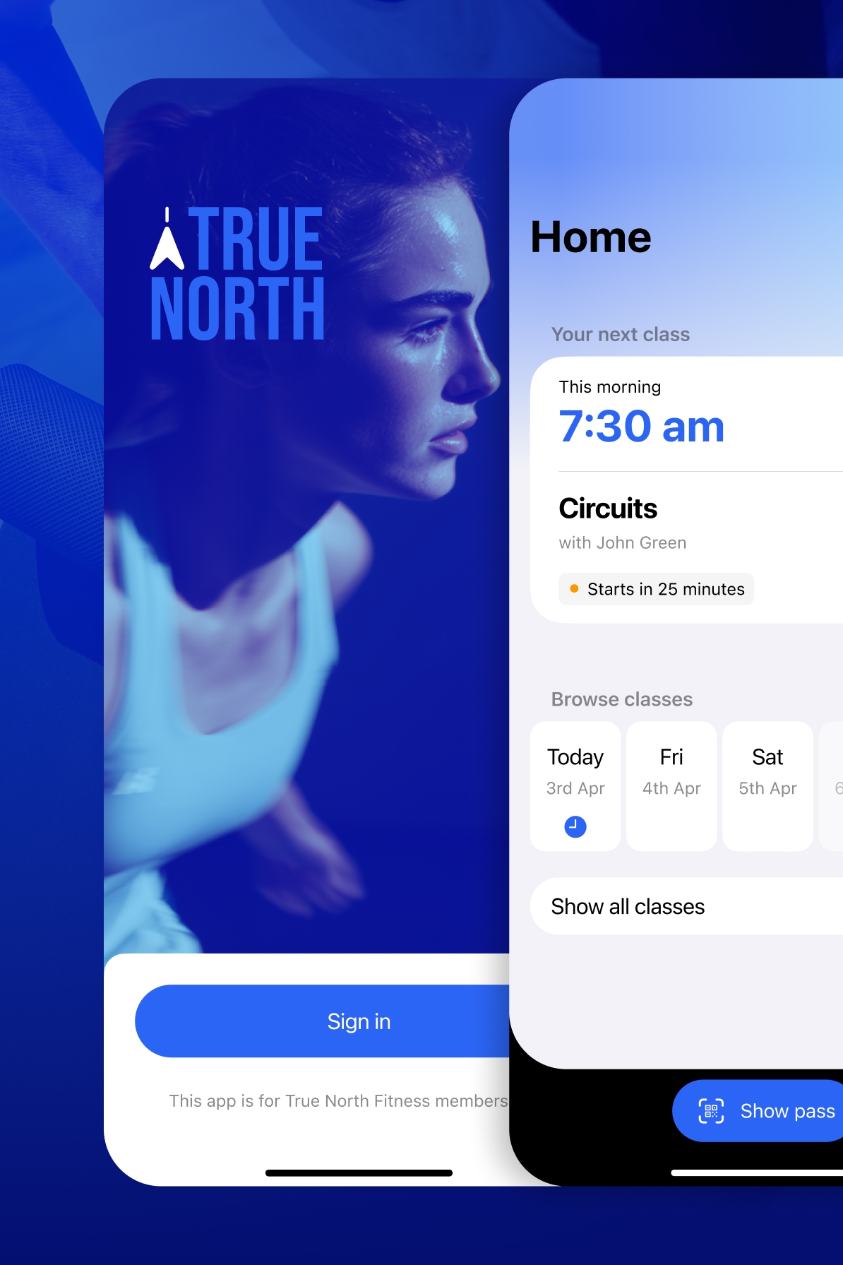
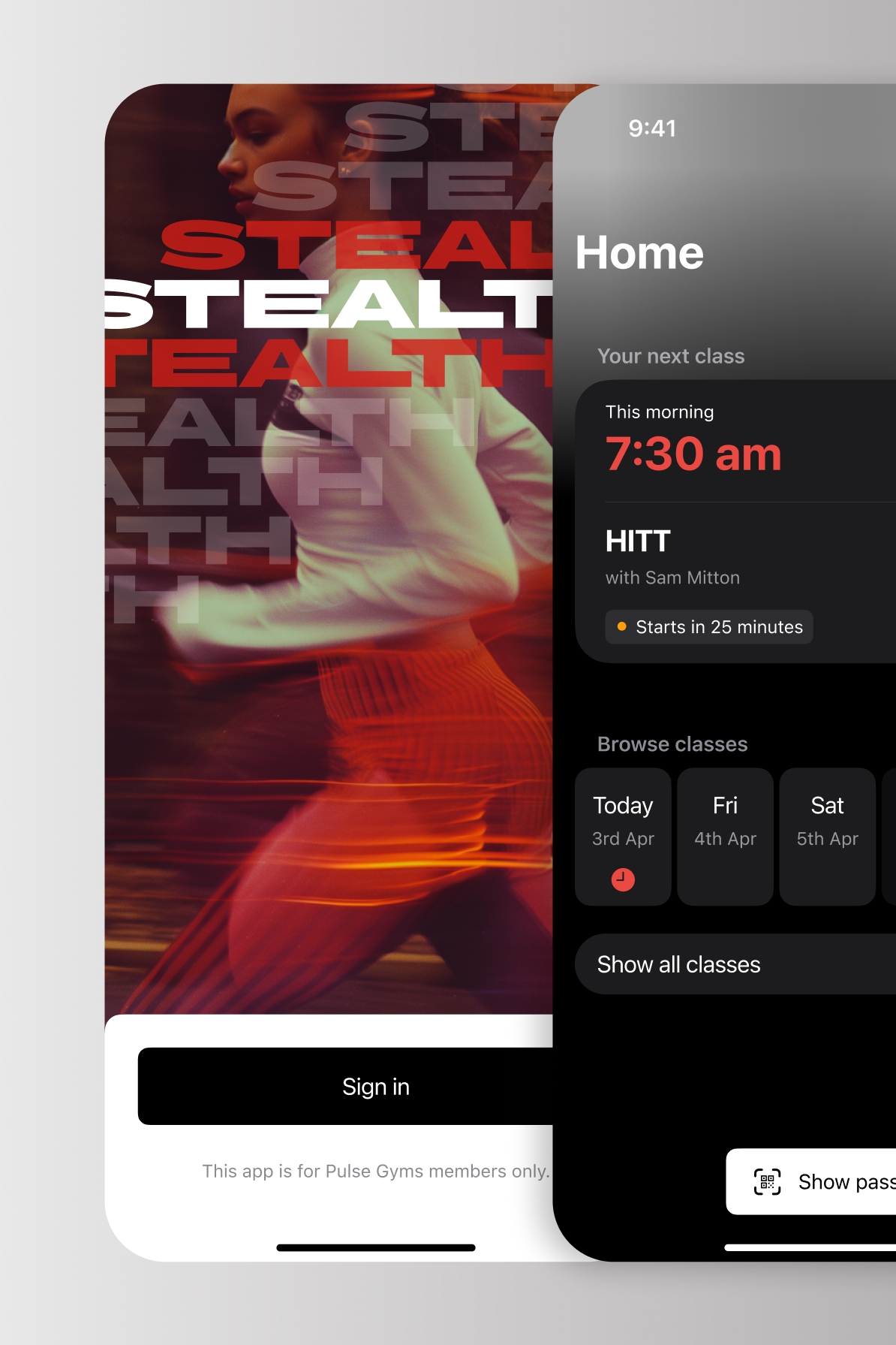
This project involved rebuilding and evolving a large-scale native mobile platform used by hundreds of fitness brands. Members use the app to manage memberships, book classes, access facilities and stay connected with their gym.
The challenge was balancing a consistent core product with the flexibility required for white-labelling across different brands, each with their own identity, pricing models and operational requirements.
The goal was to create a scalable platform that could support hundreds of implementations while maintaining a reliable, familiar experience for members and reducing complexity for product and engineering teams.
Problem space
The existing experience had grown incrementally over time, leading to inconsistency across flows and platforms. Core journeys such as booking, onboarding and membership management varied in quality depending on the brand configuration.
This created two main issues. Members experienced an uneven product experience between gyms, and internal teams struggled to ship new features without duplicating effort across brand variants.
Approach
We started by mapping the core member journeys across multiple brands to understand where variation was necessary and where it was causing unnecessary differences.
From there, we defined a shared foundation for the product experience, focusing on the most critical actions members perform: sign-in, booking classes, managing access and viewing membership status.
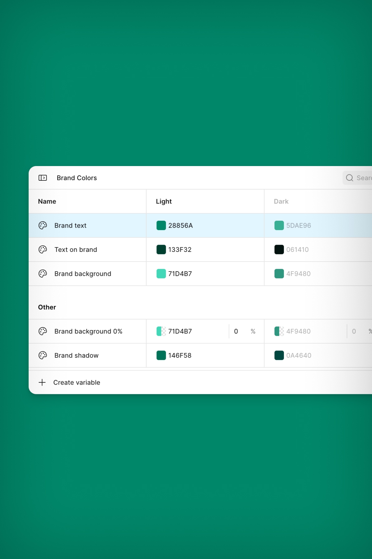
This was paired with our modular design system — Apollo Mobile — that allowed brands to customise surface-level identity while keeping underlying patterns consistent.
Key user flows
We focused on the core journeys that define whether the product works in practice: signing in, accessing the gym, and booking classes.
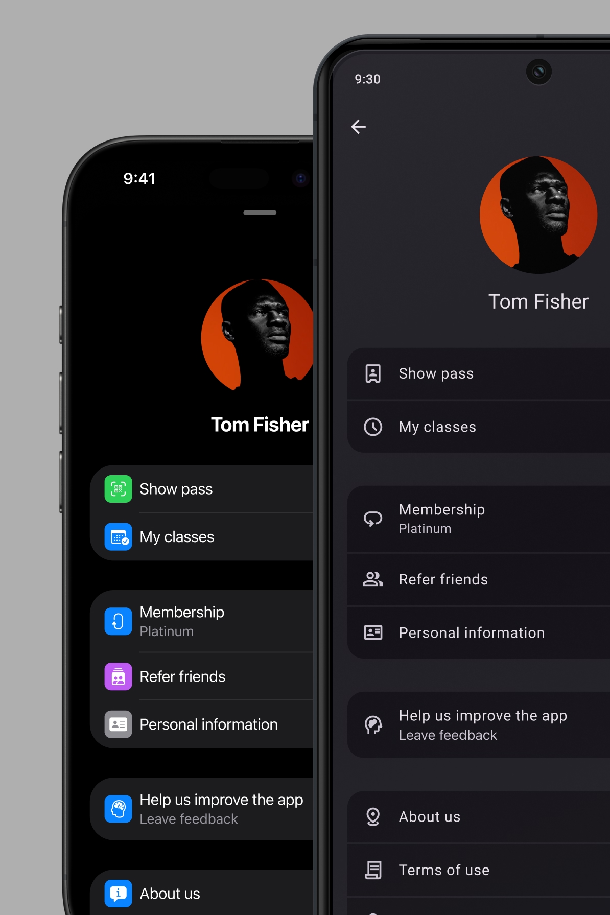
Sign in was redesigned to reduce friction and improve reliability across different authentication methods. We found that users often struggled to access their accounts, particularly when moving between gyms or reinstalling the app, so we simplified the flow and password recovery paths.
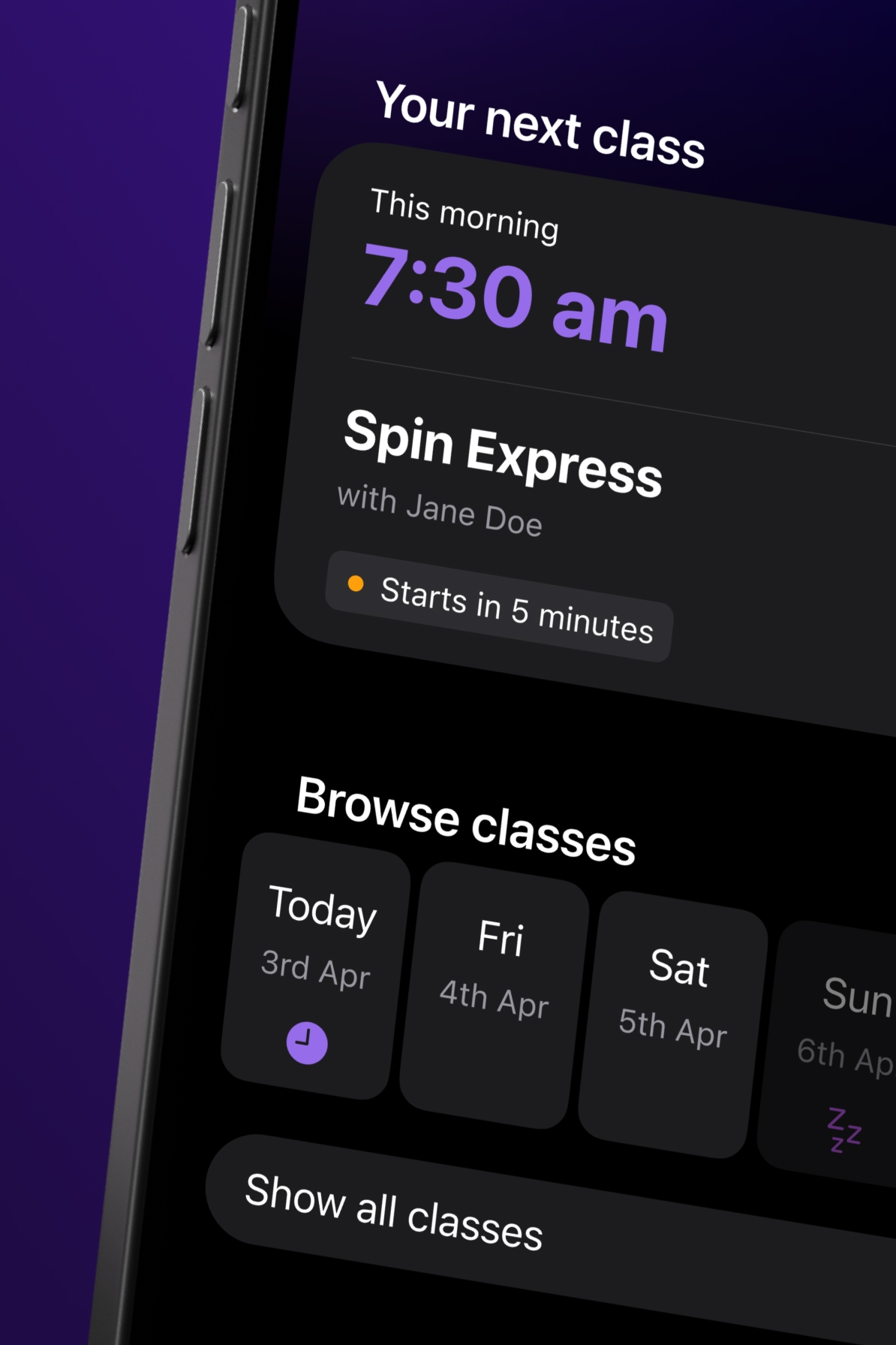
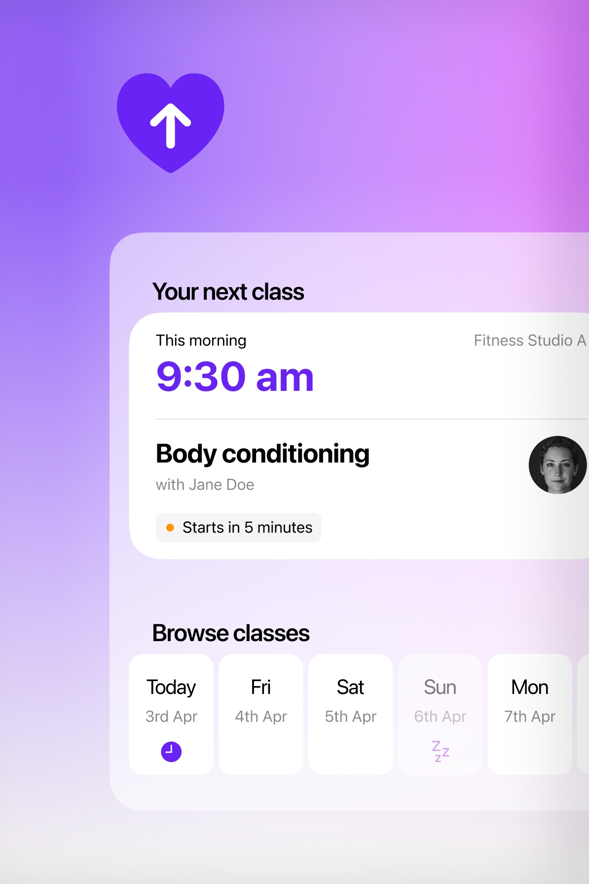
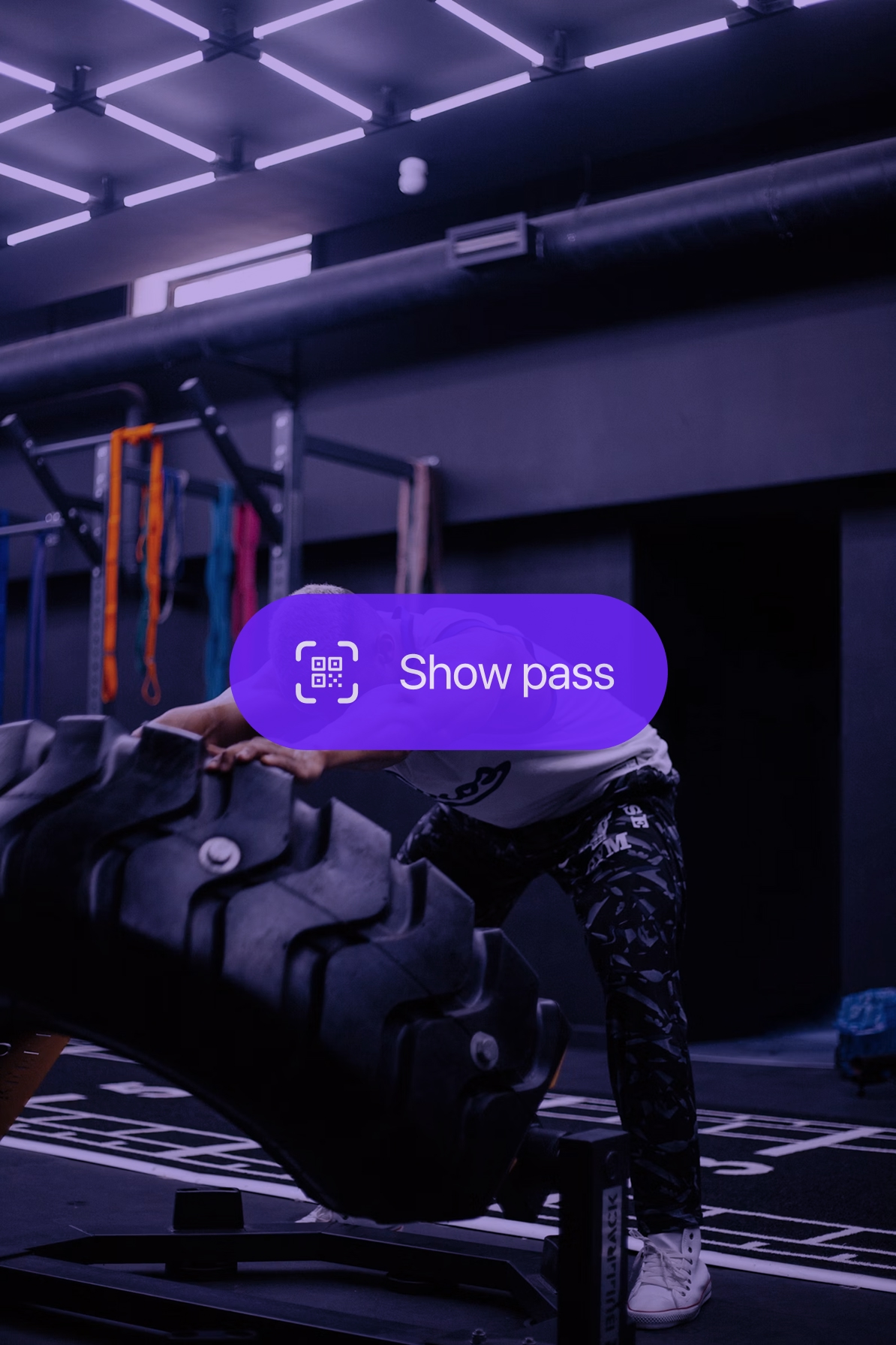
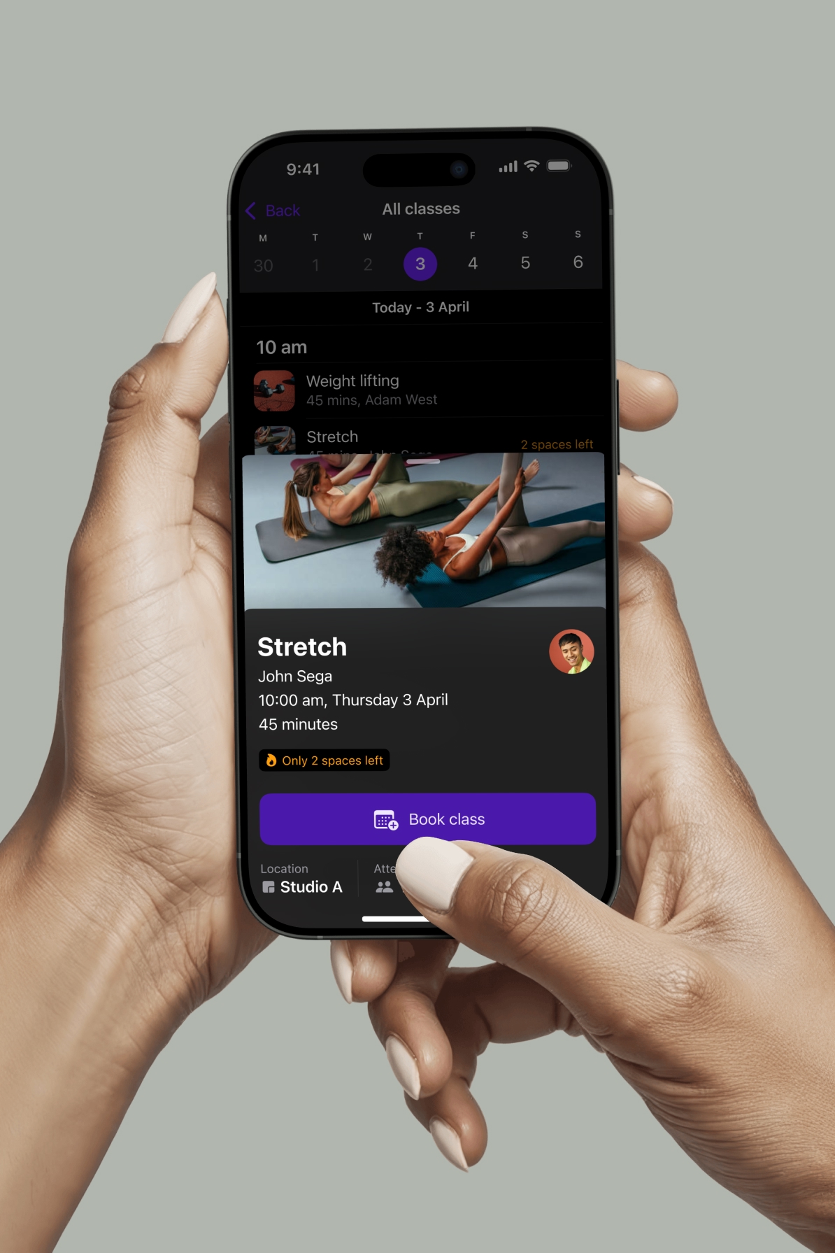
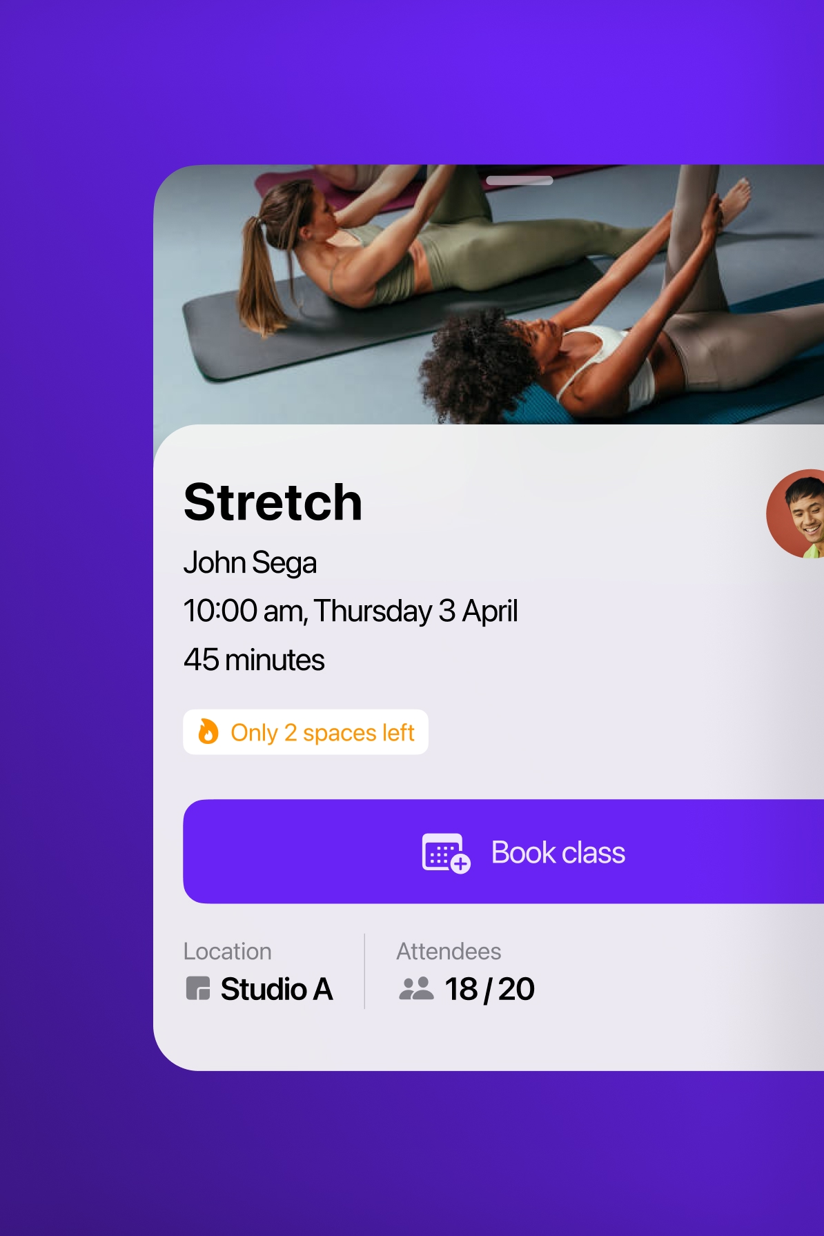
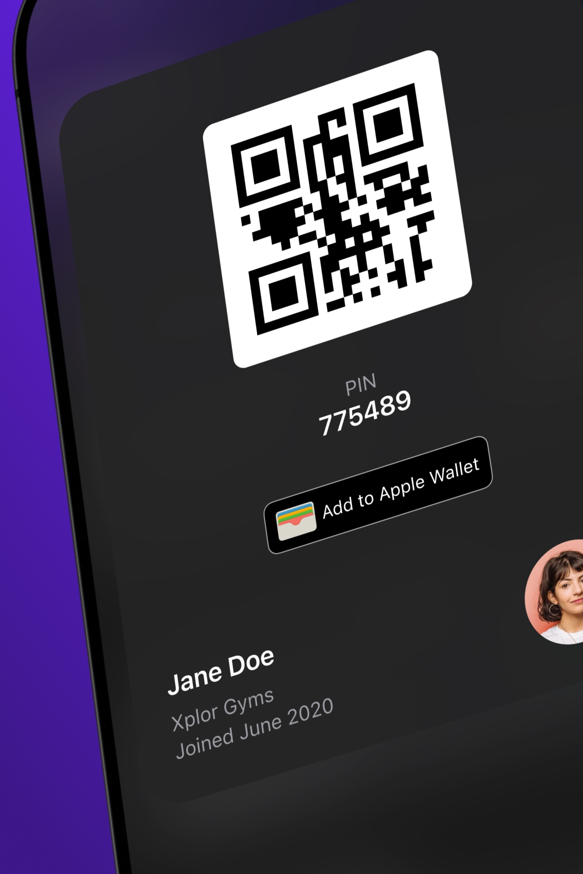
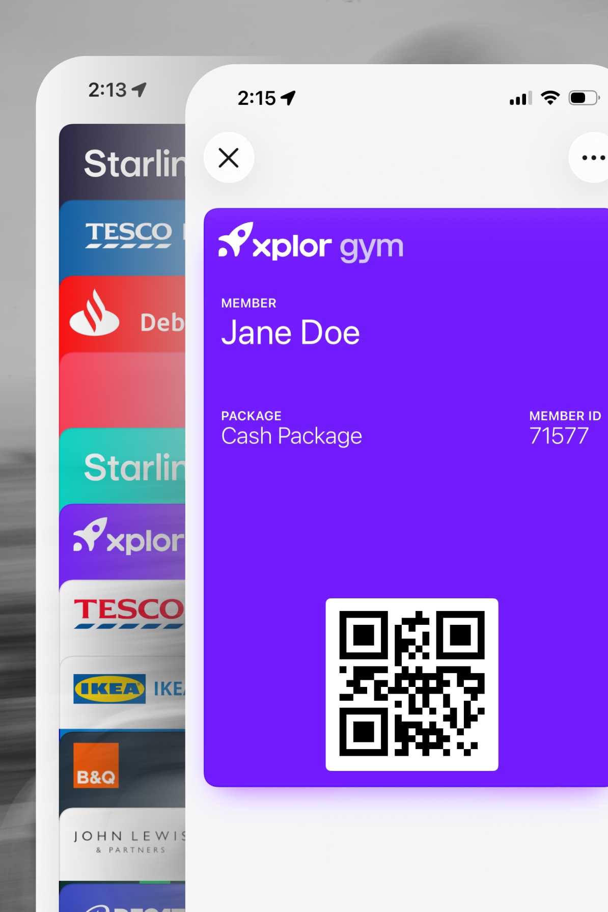
Access passes were a critical part of the experience. Members needed a fast, dependable way to present their gym access at the point of entry. We redesigned this flow to make the pass immediately available from the home screen, with clear offline behaviour and consistent presentation across brands.
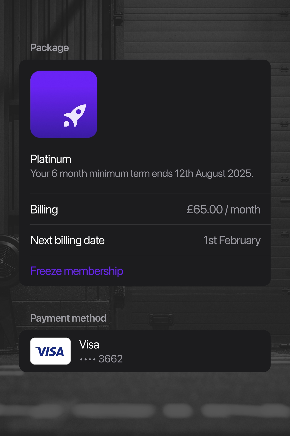
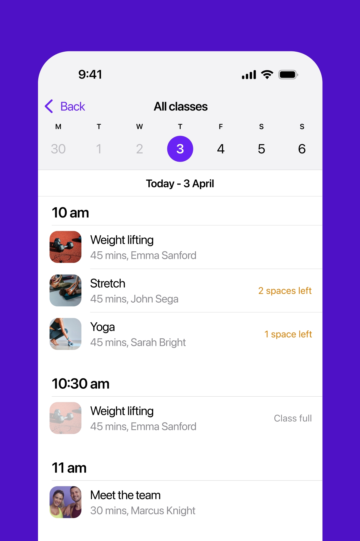
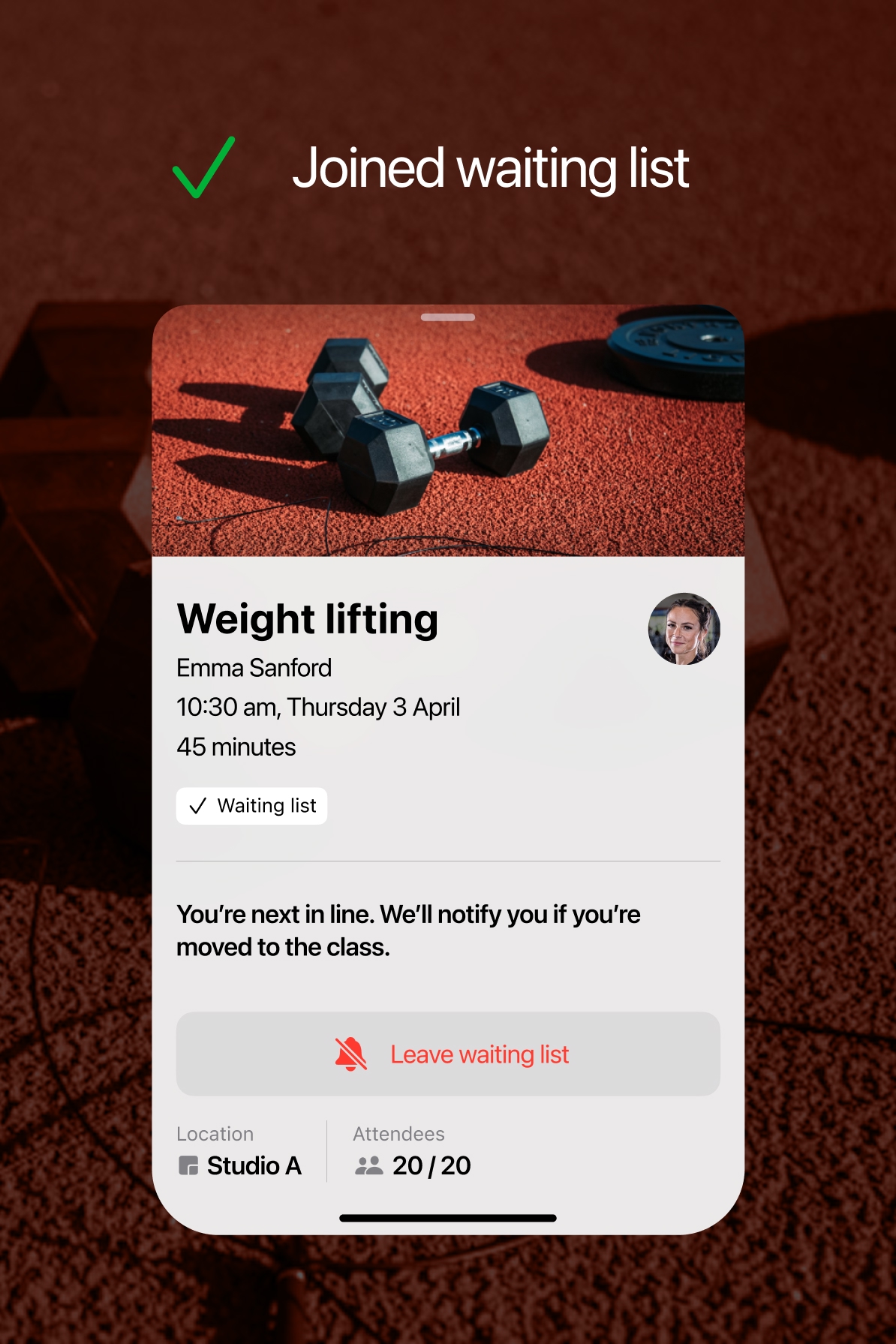
Booking flows were refined to reduce cognitive load and make availability, confirmation and cancellation states clearer. Membership self-serve was also improved, helping users to understand their active status, renewal information and entitlements without needing support.
Design system and white-labelling
A key part of the work was structuring the design system to support scalable white-labelling.
We introduced a token-based approach to branding, allowing colours, typography and visual styling to be configured per brand without changing core components. This ensured consistency in behaviour while enabling visual differentiation.
Components were designed to be flexible but opinionated, reducing the need for one-off implementations and helping teams ship faster across multiple gym brands.
Outcome
We delivered a more consistent and scalable mobile experience across a large network of fitness brands, reducing duplicated design and development effort and allowing teams to ship changes without breaking brand-specific configurations.
Gym staff spent less time dealing with access and app-related issues, and more time focused on supporting members on the gym floor.
For members, the experience became more reliable and predictable, particularly around membership self-service, sign in, gym access and booking classes.